The New Aurelia Andrea
Aurelia Andrea is reinvented.
For quite some time now, I have felt the need to change the face of Aurelia Andrea as it heads off in a slightly different direction. Aurelia Andrea still is a space to explore fashion and culture, mostly that of the Philippines (but not limited to), but a little more audacious in its ventures. Questioning, understanding, embracing, enjoying, and, perhaps, even challenging, the norm of fashion and/or different cultures are still the bulk of what my personal brand values. And the mission is still similar: tell the story of all these discoveries through fashion design and style.
What changed is the attitude of approaching these ventures and design. As I grow older, I become more self-aware and carefree. Gone are the days when the I-don’t-knows keep me from doing anything. It now is the driver to be more curious and then visualize my findings. I wanted to convey those feelings and apply them to Aurelia Andrea. It’s not always that these questions are too deep or too controversial. Sometimes, it’s as simple as enjoying new obsessions, like my recent exposure to KPop which led me deep into the phenomenon, and have no sign nor intention of going back or leaving (more on it in the future for sure).
Style, too, has changed. I used to be more structured and feminine in my style but recently, I have been interested in street, non-binary, and anti-fashion styles. The irony of looking like you did not care at all, but it took hours to decide on an all-black outfit. It just enticing to me, to be honest. My 16-year-old self will be shocked. However, tailored fashion is still in my DNA, which juxtaposes the casualness of the street. Tailored street, I’d like to call it. When two contrasting elements come together to confuse, shock, or even make one rethink is so intriguing and exciting.
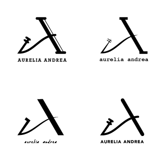
So juxtaposition is a huge element to this new Aurelia Andrea. I guess, it always has been there. Like Aurelia Andrea’s personality, there are two opposing characteristics that work well together: strong and playful. This is the brand identity and this is where I started designing the new logo. One strong bold line interlaced with fluid lines to form the Roman capital letter A. Since I am, first and foremost, Filipino at birth, I wanted to infuse a Filipino element that is subtly present in the logo. I did not want it to be the main focus of the design, but an element that will work next to another. It took a number of iterations to get to this stage. In the end, the design is composed of two letter A’s: Roman letter and Filipino indigenous script. Together it forms a single A, but it represents two, an acronym of the brand.
The concept did not change, just the feel. I said goodbye to purely dynamic, ultra-feminine lines. It’s time to take a stronger stand, but just keep a little bit of fluidity because ya know what? Life changes.
No Comments